Crunchyroll Homepage Redesign Project
I worked with one other designer on a redesign of the homepage for the anime streaming website, Crunchyroll.
My Role: I was responsible for doing research, research analysis and synthesization, ideation, wireframing, and animations.
Task: My partner and I challenged ourselves to a 3 day project where we would create a redesign of the Crunchyroll homepage.

The Problem
The current design of the Crunchyroll homepage is dated and extremely cluttered. This creates a confusing experience for users; one which does not aid the users' task flows of either watching their favorite shows on Crunchyroll or attempting to find other shows that they might like.
The Solution
By focusing on clarity, our design will not only aid the users' task flows on Crunchyroll, but also create a more engaging overall experience by minimizing confusion.
Research
Our research consisted of competitive and comparative analysis. We looked at IGN.com, Youtube, Steam, and also Netflix. The insights we gained from our research led us to focus our design on 3 aspects of the homepage; the search bar, the hero carousel, and the news feed.
Design
Current Crunchyroll homepage
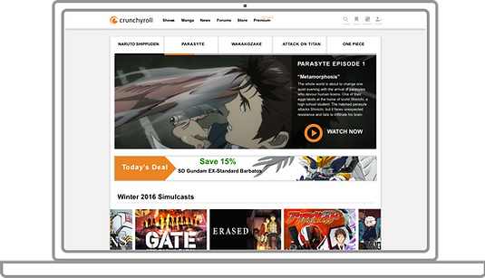
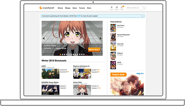
The current organization of information on the homepage can be confusing and unclear. For example, although there is a hero carousel that offers users a glimpse of several featured shows, right next to it is another section highlighting featured shows.

The overwhelming amount of information and how it's presented gives the homepage an extremely cluttered view. Futhermore, the current design has the "All-New Anime" and "All-New Drama" sections near the bottom of the page where it can easily be missed if the users do not scroll that far down.

Redesigned homepage
In our redesign, we moved the "All-New" sections up closer to the top of the page. Users go to Crunchyroll primarily to watch shows, so it made sense to highlight them where users would not miss them. This helps users to discover brand new shows. Also, the reorganized "News" section presents the latest relevant news in a much clearer way.

Redesigned hero carousel
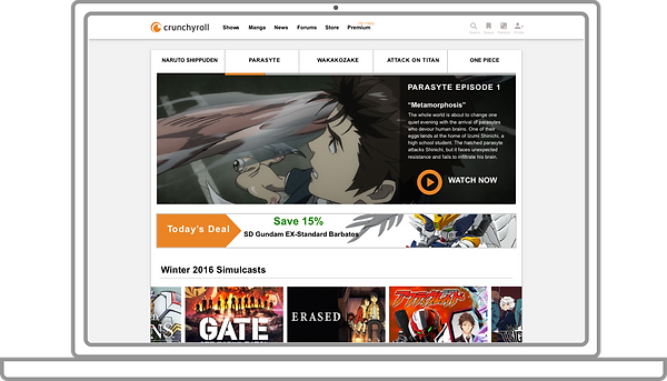
The hero carousel of featured shows was completely redone with clarity in mind. Instead of having two separate sections promoting featured shows, the hero carousel becomes the main focus of the users when first landing on the homepage. Not only is it much bigger, but the progression bar with show titles clearly indicates what you're looking at now and what you'll be seeing next. Here it is in action!

Redesigned show preview
By hovering over a preview image, the user can reveal details and a short synopsis of a particular show. By organizing show previews in this way, we avoid unnecessary clutter which plagues the current design. This allows for a much cleaner and clearer user experience. Here is an example of the design.

Redesigned search bar
Lastly, we redesigned the search bar so that it only shows when the user clicks on the icon. This design further helps the homepage in avoiding clutter and minimizing confusion while optimizing clarity.
Current design

Redesign

Before

After

Our redesign of the homepage provides a much clearer view and organization of information. With this design, much more emphasis was placed on the users' task flows and aiding them through the process in order to create a better user experience.
(Click on the image to view the full length wireframe.)
Here is a final before and after look at our Crunchyroll homepage redesign.
